This vignette demonstrates how to infer and plot species activity patterns.
library(camtrapviz)

library(dplyr)
library(ggplot2)
library(activity)
library(ggiraph)
# library(hms)
Import and prepare data
data(recordTableSample, package = "camtrapR")

# Convert hours to times format
recordTableSample <- recordTableSample |>
  mutate(Time = chron::times(Time))

# Convert dates to POSIX
recordTableSample <- recordTableSample |>
  mutate(DateTimeOriginal = as.POSIXct(DateTimeOriginal,
                                       tz = "Etc/GMT-8"))
We also need the coordinates if we want to use solar time (not run here):
# data(camtraps, package = "camtrapR")
#
# camtraps_sf <- sf::st_as_sf(camtraps,
#                             coords = c("utm_x", "utm_y"),
#                             crs = 32650)
# # Reproject in WGS84 (a.k.a. EPSG:4326)
# camtraps_sf <- sf::st_transform(camtraps_sf, 4326)
#
# # Get coordinates of centroid
# sf::st_combine(camtraps_sf) |>
#   sf::st_centroid() |>
#   sf::st_coordinates(camtraps_sf)
# #             X        Y
# # [1,] 117.2227 5.479598
Then, we need to convert time to radians (and possibly solar time too, i.e. a time in radians where times are transformed relative to the sunrise and sunset times).
# Convert times to radians
recordTableSample <- recordTableSample |>
  mutate(time_radians = as.numeric(Time)*2*pi,
         .after = Time)

solartime_rec <- solartime(recordTableSample$DateTimeOriginal,
                           lon = 117.2227, # mean longitude
                           lat = 5.479598, # mean latitude
                           tz = 8)

recordTableSample <- recordTableSample |>
  mutate(time_solar = solartime_rec$solar,
         .after = Time)
For this example, we will use the species PBE from the example dataset.
# Select the desired species
PBE_records <- recordTableSample[recordTableSample$Species == "PBE", ]
Plot histogram of observed data
First, let’s plot the observed data.
By default freq is TRUE and the histogram
bar height represents the observed number of individuals in this
category.
plot_activity(dfrec = PBE_records,
              time_dfrec = "Time",
              unit = "clock")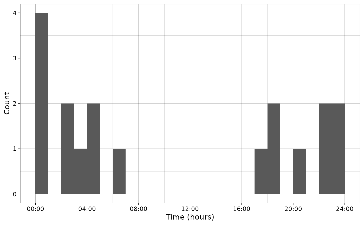
Using interactive = TRUE, the graph can also be made
interactive with ggiraph.
p <- plot_activity(dfrec = PBE_records,
                   time_dfrec = "Time",
                   unit = "clock",
                   interactive = TRUE)
girafe(ggobj = p)
It is also possible to plot the density by setting freq
to FALSE. In that case, the bar area represents the
frequency of individuals in the category. Hence, the total area under
the histogram is 1.
p <- plot_activity(dfrec = PBE_records,
                   time_dfrec = "Time",
                   unit = "clock",
                   freq = FALSE,
                   interactive = TRUE)
girafe(ggobj = p)
The scale can also be set to radians.
p <- plot_activity(dfrec = PBE_records,
                   time_dfrec = "Time",
                   unit = "radians",
                   freq = FALSE,
                   interactive = TRUE)
girafe(ggobj = p)
Infer activity patterns
We fit a density function using the activity package.
For that, we use the function fitact that adjusts a density
curve using von Mises functions as kernel.
This function takes as input at least a vector of times (in radians):
vm <- activity::fitact(PBE_records$time_radians)This object is of class actmod and contains slots:
-
@data(original data) -
@wt,@bwand@adj(slots related to the model parameters) -
@pdfwhich is the probability density function for in -
@actwhich is the proportion of time spent active (between 0 and 1)
Plot density curve
To plot the density curve, we need to extract the data frame
corresponding to the probability density function from the
actmod object.
pdf_vm <- as.data.frame(vm@pdf)
plot_activity(dffit = pdf_vm,
              time_dffit = "x",
              y_fit = "y",
              unit = "radians",
              freq = FALSE)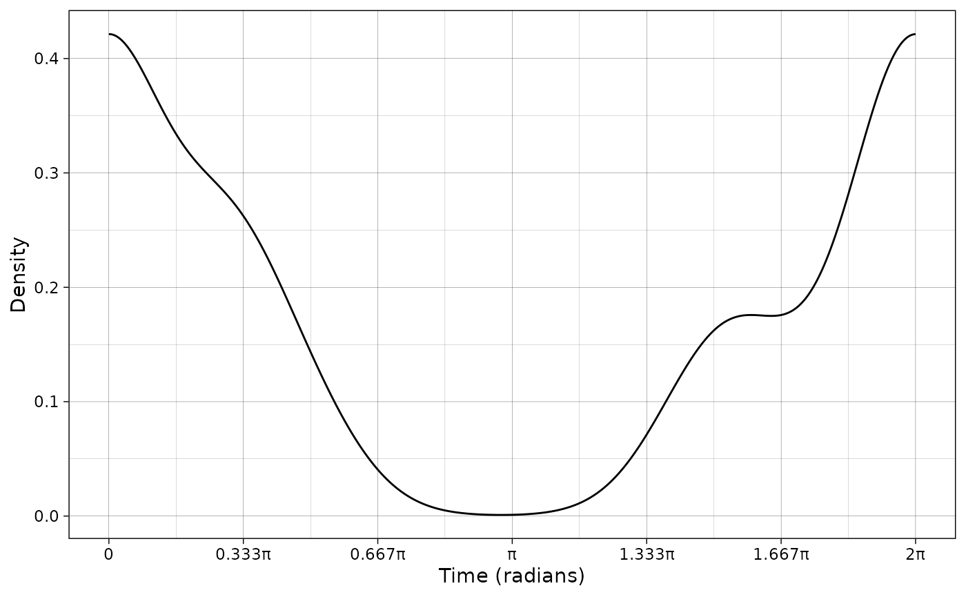
Plotting the predicted counts is also possible. In that case, the integral under the curve scaled to hours (even if the scale is in radians) represents the number of observations.
plot_activity(dffit = pdf_vm,
              time_dffit = "x",
              y_fit = "y",
              unit = "radians",
              freq = TRUE,
              n = nrow(PBE_records))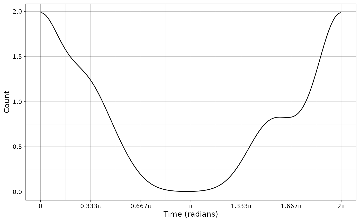
It is also possible to plot the scale in hours:
plot_activity(dffit = pdf_vm,
              time_dffit = "x",
              y_fit = "y",
              unit = "clock",
              freq = TRUE,
              n = nrow(PBE_records))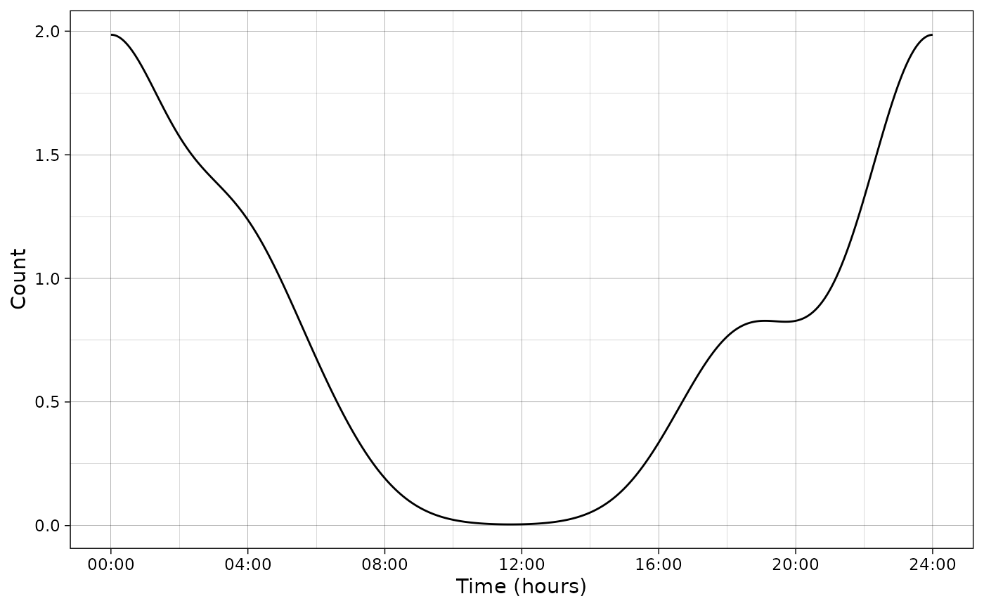
Plot density curve and histogram
It is also possible to plot the data and the density, combining various parameters illustrated before (radians or hours, frequency or count…) Below is an example:
p <- plot_activity(dffit = pdf_vm,
                   time_dffit = "x",
                   y_fit = "y",
                   dfrec = PBE_records,
                   time_dfrec = "Time",
                   unit = "clock",
                   freq = TRUE,
                   interactive = TRUE)
girafe(ggobj = p)
Infer activity patterns with sun times
We can also use the sun-adjusted times to infer the activity times:
vm_sun <- activity::fitact(PBE_records$time_solar)
pdf_vm_sum <- as.data.frame(vm_sun@pdf)
p <- plot_activity(dffit = pdf_vm_sum,
                   time_dffit = "x",
                   y_fit = "y",
                   dfrec = PBE_records,
                   time_dfrec = "Time",
                   unit = "clock",
                   freq = TRUE,
                   interactive = TRUE)
girafe(ggobj = p)